BEFORE & AFTER GALLERY
Drag the bar on the image to the right or the left to see the before and after.
For this 1980's home, the Rochman Design Build team took out the walls between the kitchen and dining room to give our clients more flow and space, re-arranged the back entry, renovated the mudroom, created a working pantry, and - of course - renovated the kitchen. In addition, the living room got an addition of a light shaft as well as built in shelves but the true wow factor was the transformation of the master bath. Follow THIS link to see what we mean.
Our clients came to Rochman Design Build with a desire to add to their 1930's Tudor style house that they love, while respecting the style and character. We added a new 2nd floor primary bedroom, bathroom and walk-in closet built over the existing dining room and kitchen. Some cool features in the primary suite will include a gas fireplace and entertainment center in the primary bedroom, additional seating area to enjoy the warmth of their new fireplace, coupled with a thin bezel TV that doubles as an art frame, lush cabinetry, and accent lighting for a soft finishing touch. The first-floor bedroom was converted into a home office. Follow THIS link to see all the photos.


Our clients came to the Rochman Design Build team with a request that we turn their simple ranch house into a multi generation home, transforming this traditional ranch into a contemporary 2-story home. Our team enlarged the existing garage and living room, added a new family room on the first floor, a new formal entry and mudroom, renovated the existing 1st-floor en-suite, and added a modern stair tower to the 2nd-floor. The new 2nd-floor now has 4 bedrooms including a master suite, and 2 home offices. You can see how the project unfolded as well as the after photos here.


For this project on this 1930’s traditional brick Ann Arbor home on Devonshire, our team at Rochman Design Build converted the existing garage into a den, and a mudroom with plenty of seating, as well as incorporated a flex space of home office / guest room. We also changed the layout of the kitchen and dining room into a more open space, with a bench seating area. You can see the project as it unfolded as well as the after photos here.
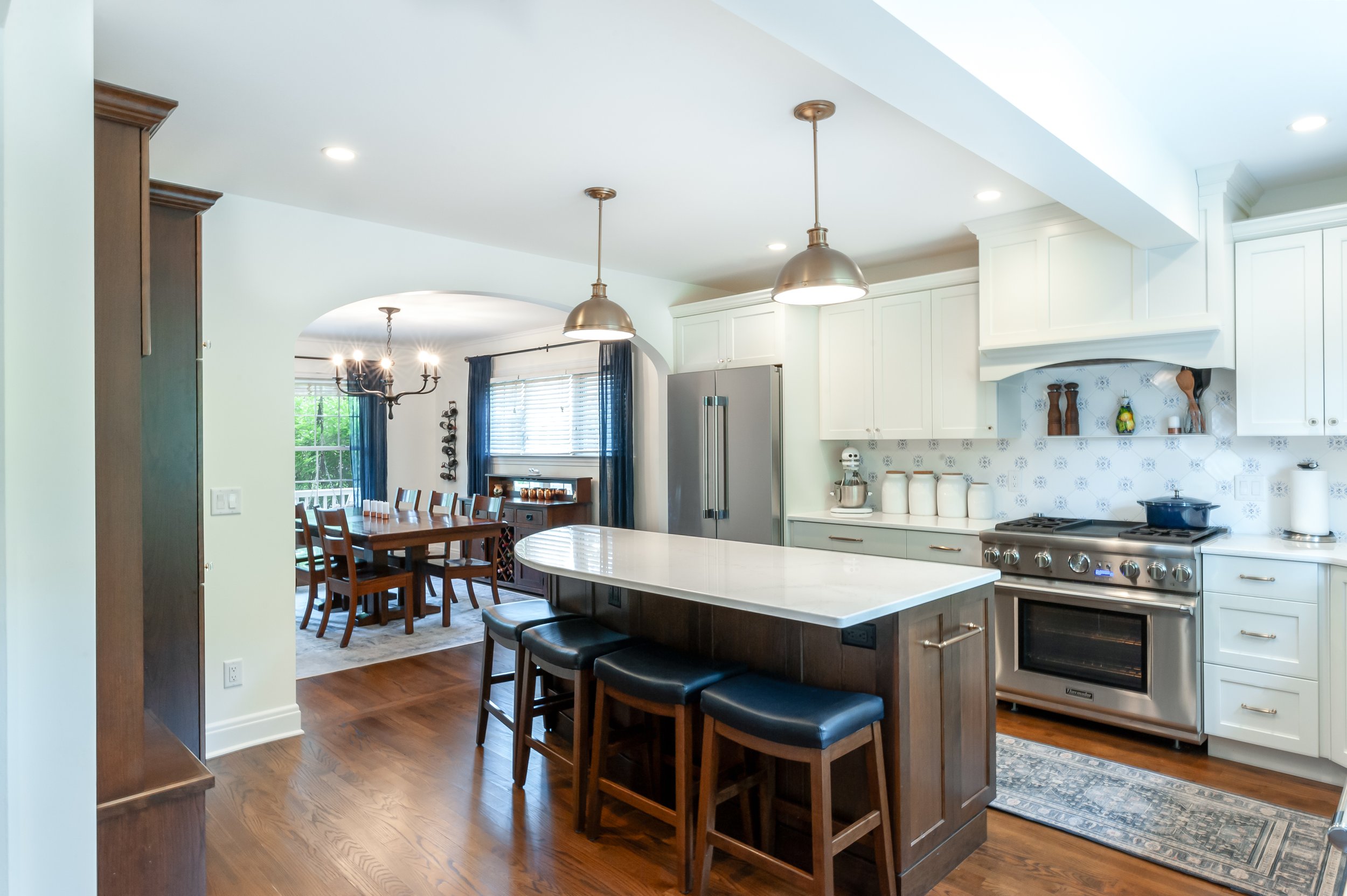
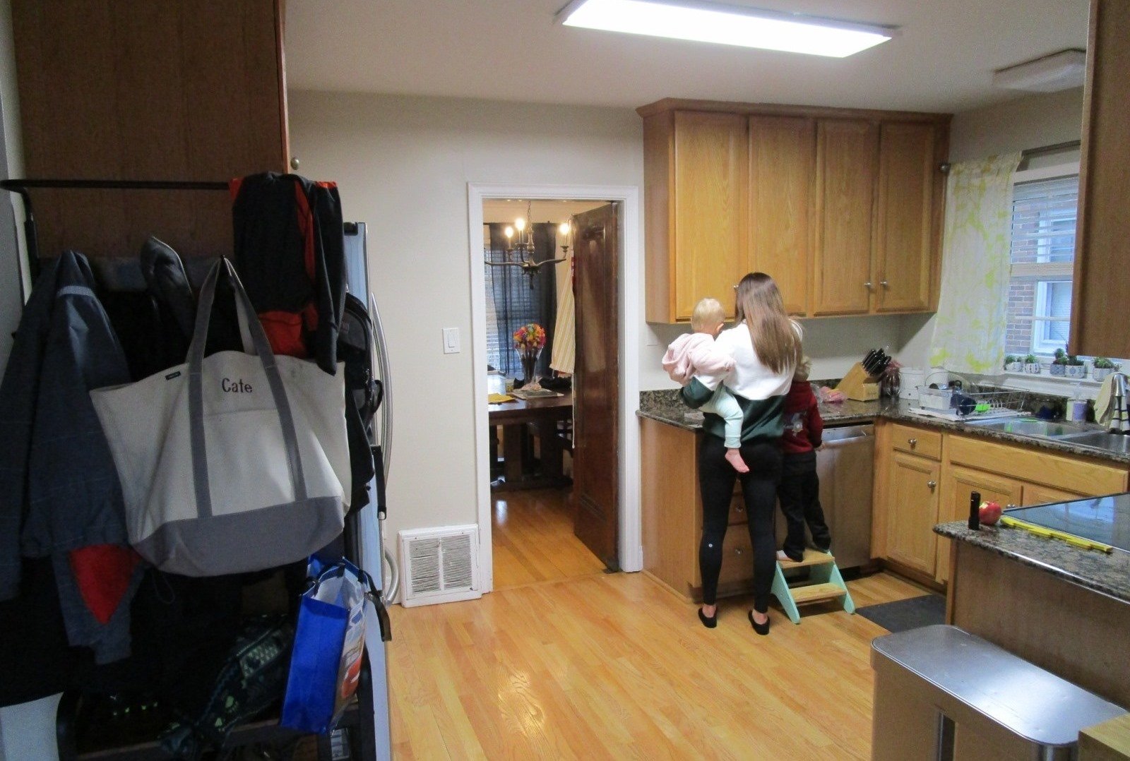
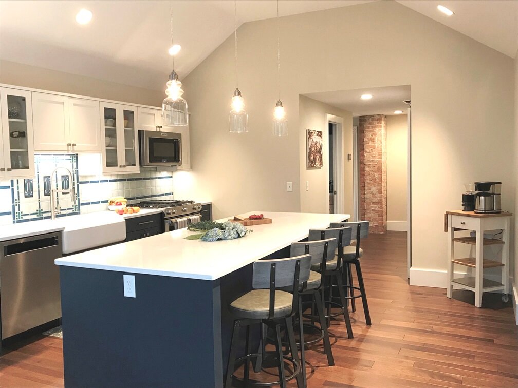
Our clients in Burns Park were ready to transform their small and cramped kitchen into something that is more spacious and family friendly, including a cubby / mudroom area for little backpacks and coats. The color board for the kitchen, off white and chocolate cherry stain, as well as the blue and white hand painted tiles was inspired by our clients’ honeymoon in Portugal. You can see the project as it unfolded as well as the after photos here.
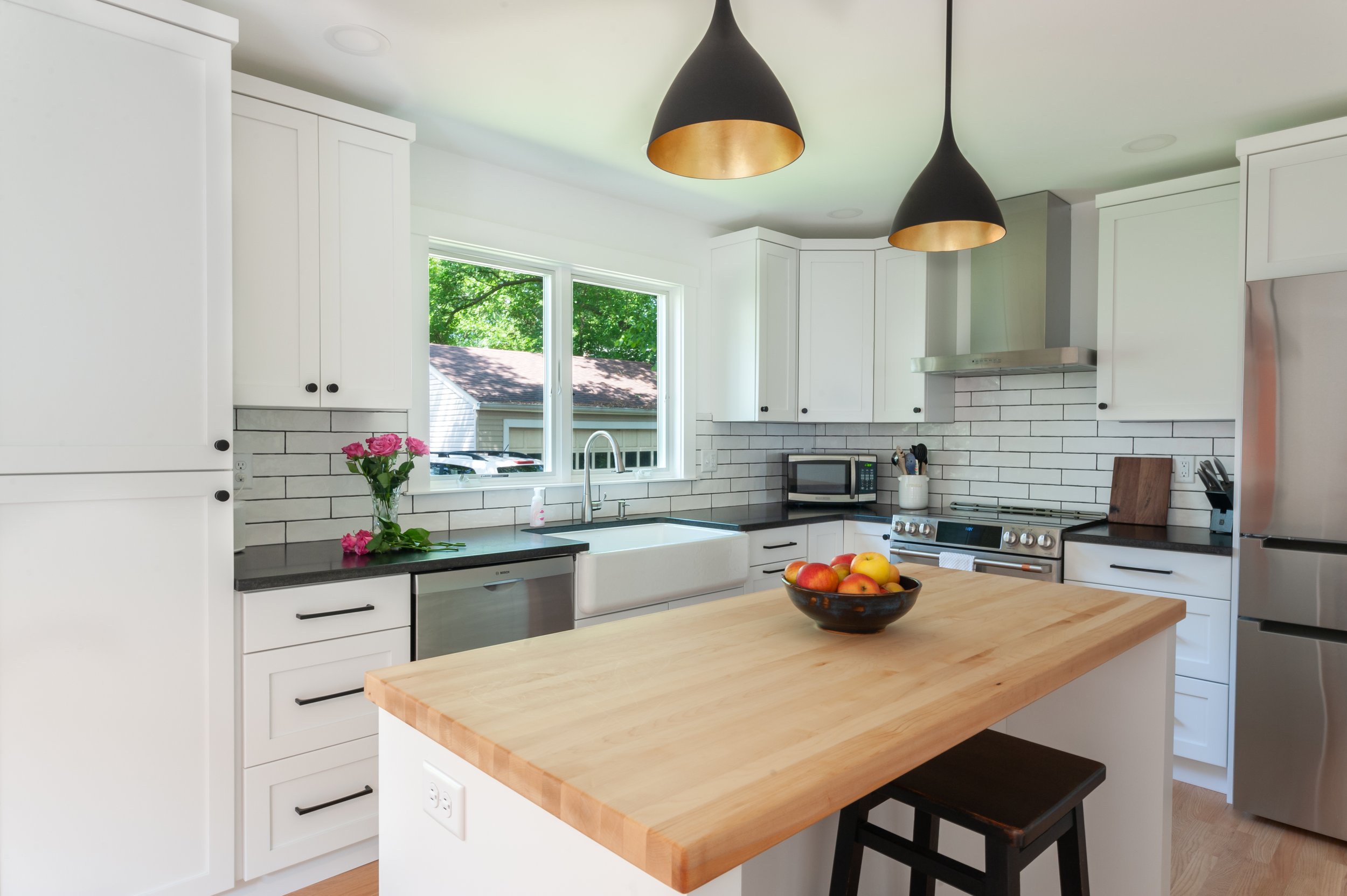
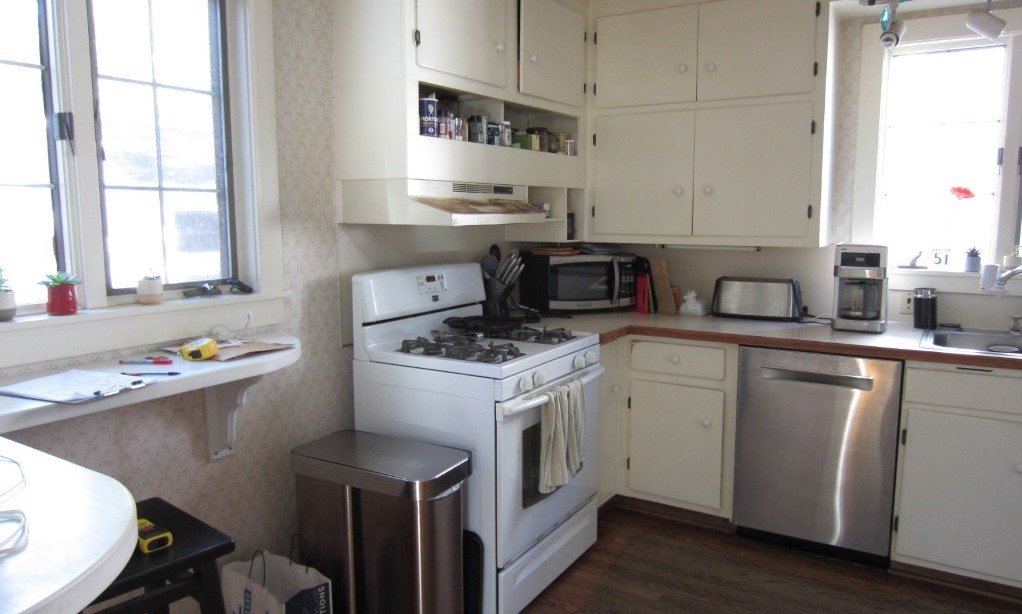
This house in Lower Burns Park in Ann Arbor had a small, cramped and chopped kitchen with no eating area or space for a family to cook or gather. The Rochman Design Build Team stayed with the clients' feel for a more European kitchen, opened up the walls, and created a space where the family can now make dinner, do homework or put groceries away, all at the same time :-). You can see the project as it unfolded as well as the after photos here.
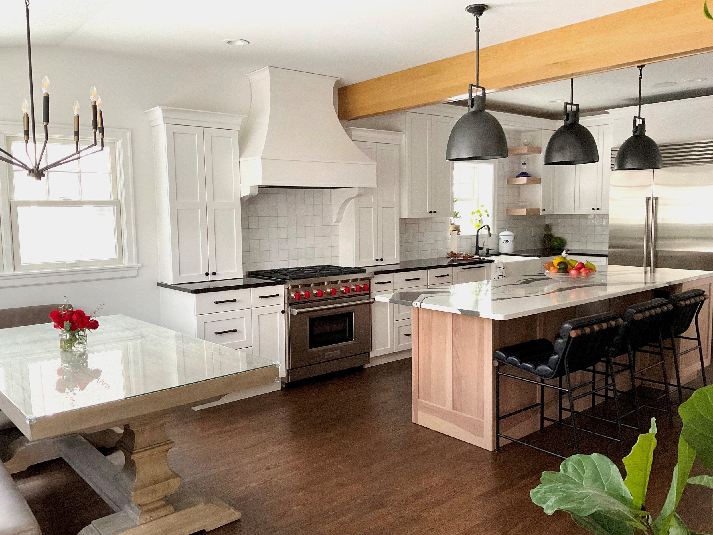
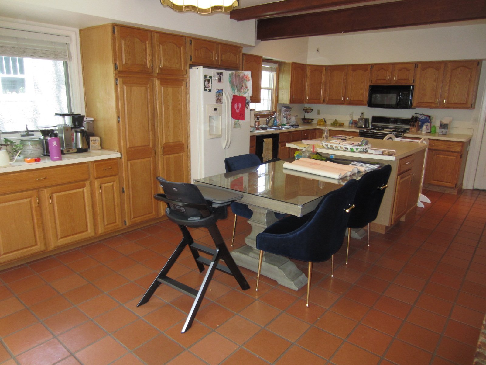
Our clients loved their 1920s Dutch Colonial in Burns Park; the kitchen however, was about to get a gorgeous upgrade. The kitchen remodel of this classic Ann Arbor home by Rochman Design Build includes a dramatic black and white Cambria Bentley island, Riverwood Hickory cabinets and Zellige handcrafted clay tile for the backsplash. View the project as it unfolded here.
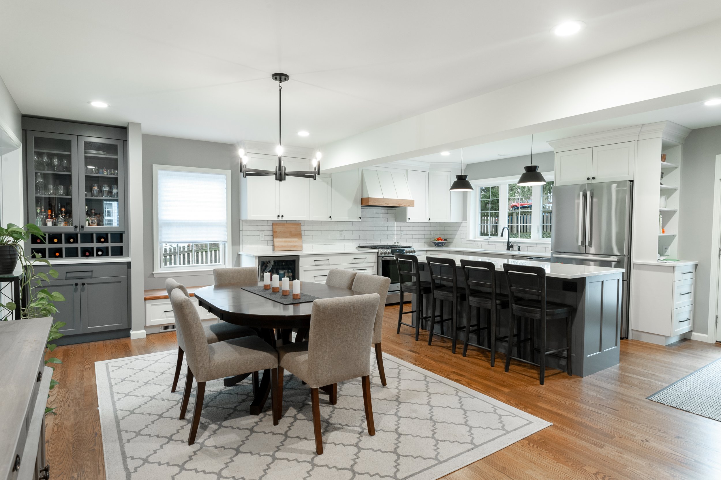
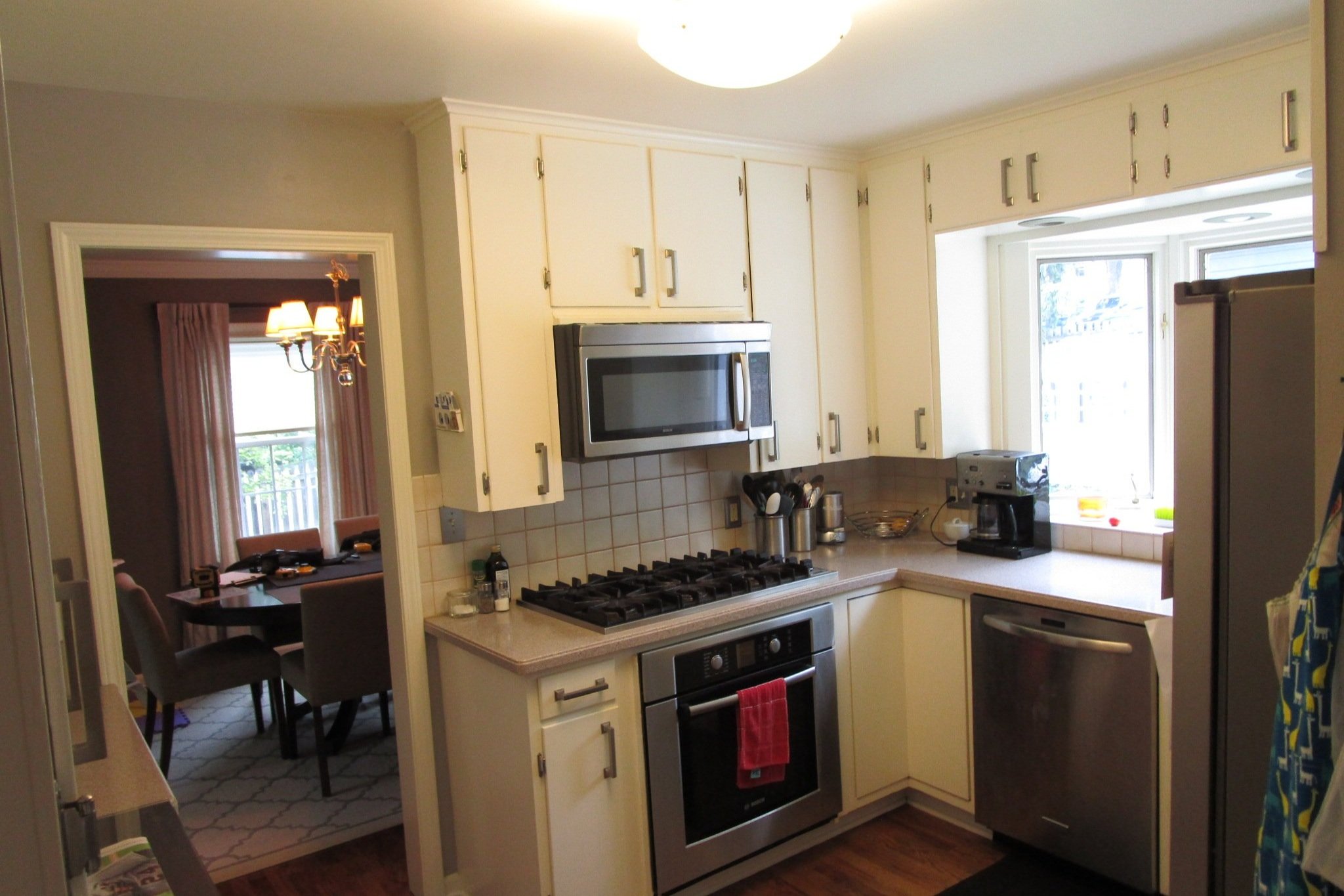
Our clients loved their 1950’s two-story home on the Old West Side of Ann Arbor, but the house contained 3 bedrooms and 1 bathroom on the second level and a small, cramped kitchen on the main floor. The Rochman Design Build team worked with the homeowners to develop a revised layout that included a two-story addition affecting both levels. On the main level, we opened the kitchen and dining room to create a flowing and functional floorplan with a large central island, a wine hutch, a charming window bench and a new mudroom entry area. On the second floor, our team added a new full bathroom and walk-in closet to the primary bedroom. To see the project as it unfolded as well as after photos follow this link.
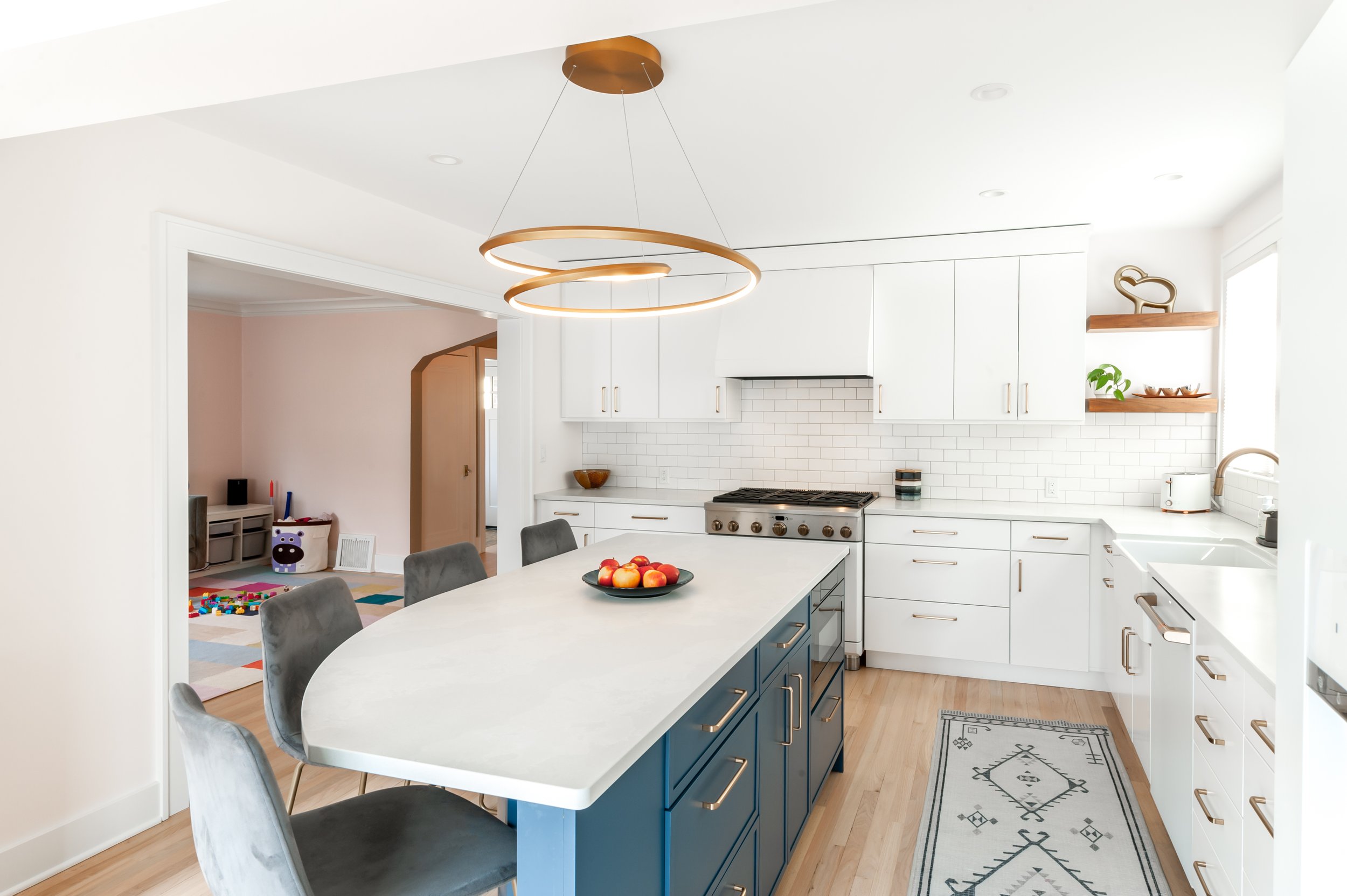
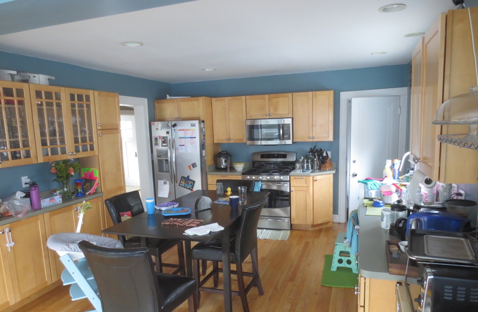
This solidly-built 2-story brick home had almost everything going for it, except a mudroom. A few square feet at the edge of the stairway was the only space for shoes where the family always entered, and in Michigan that is a big problem. The circulation cut through the main working corner of the kitchen and reduced cabinets and continuous counterspace. By shifting the kitchen wall 30” we created a mudroom space and renovated the kitchen with better function and beautiful materials. Click here to see how the Rochman Design Build team transformed the former kitchen and created an open space for family entertaining.
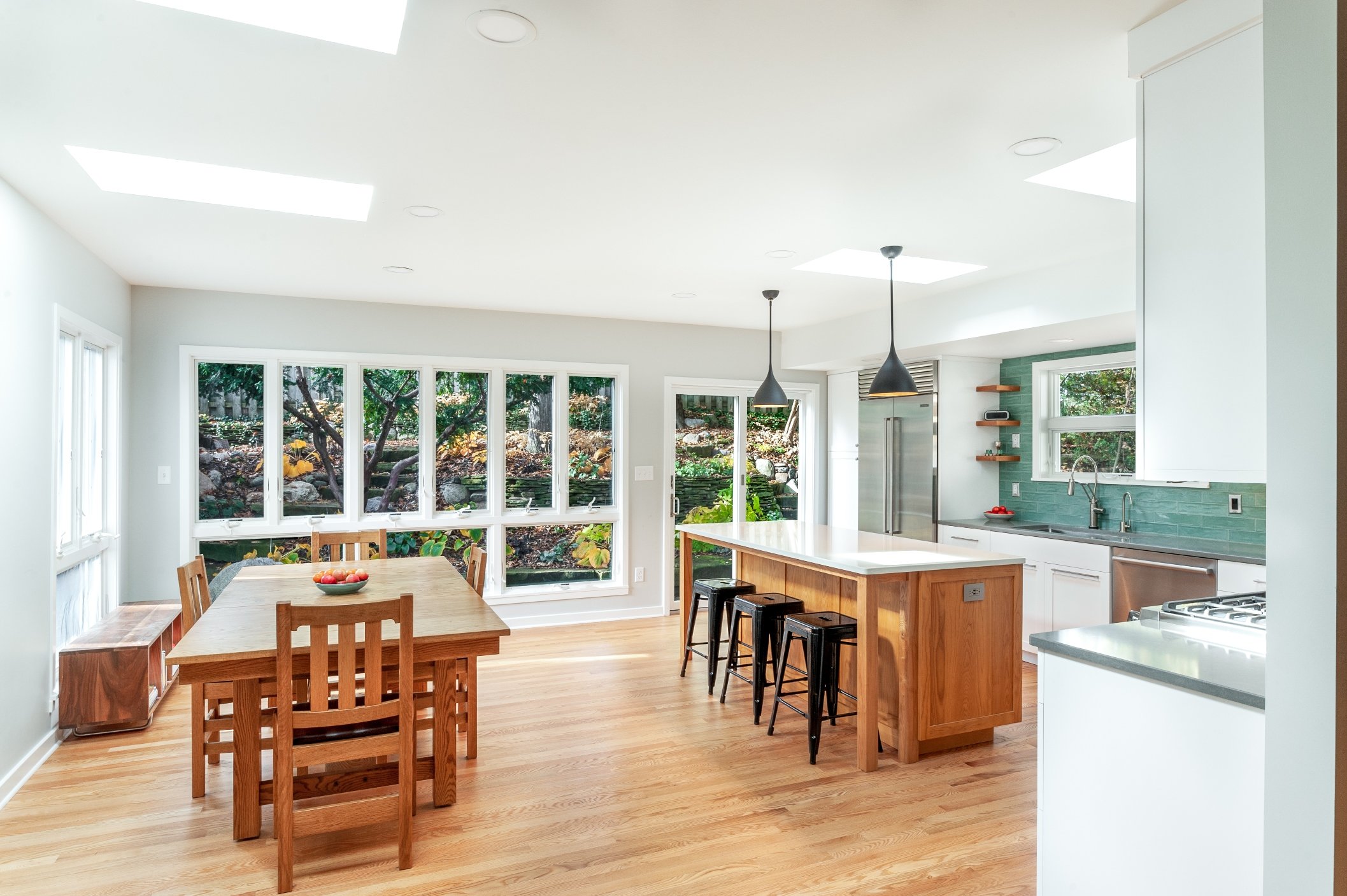
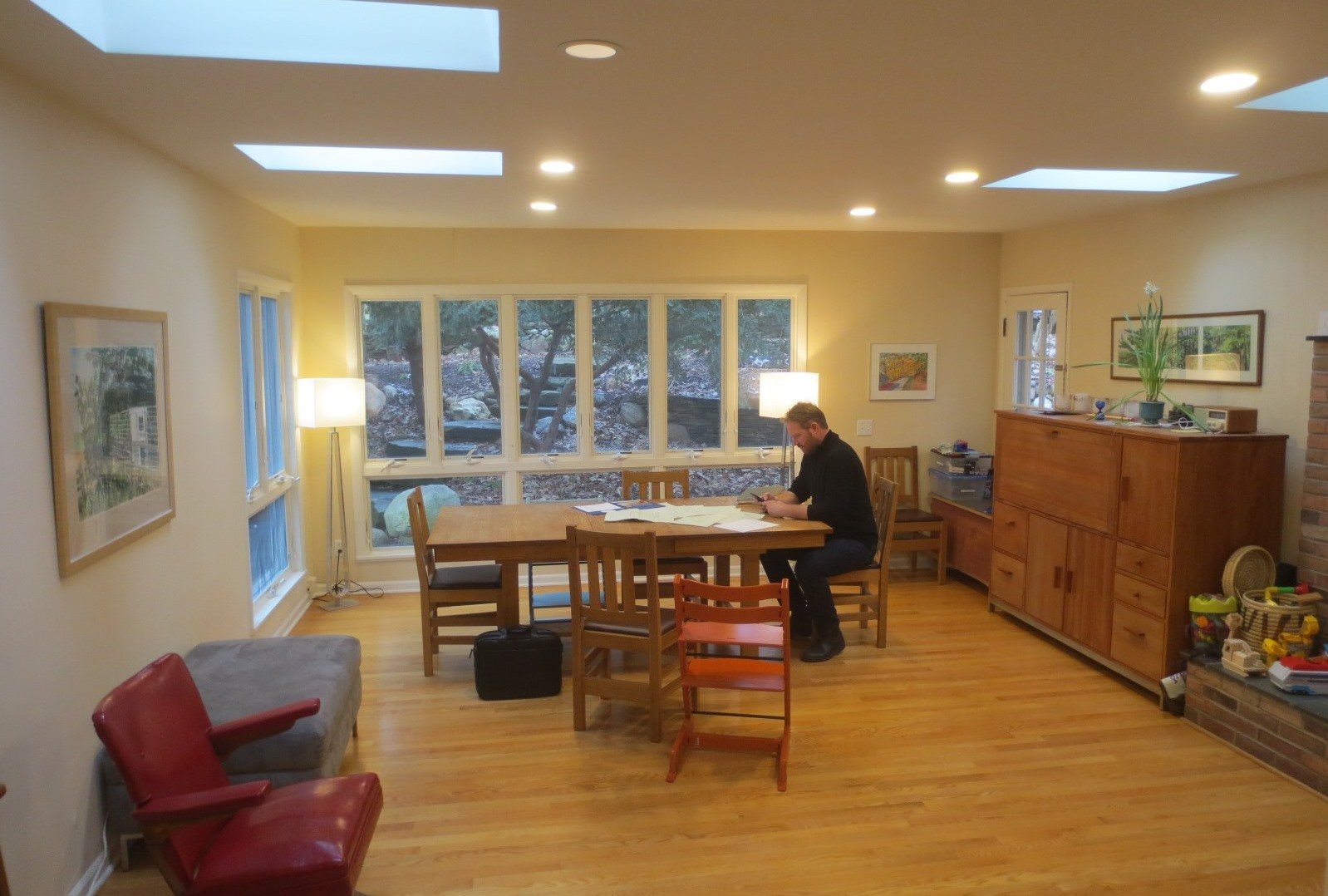
The side entrance in this Old West Side home in Ann Arbor led right into a narrow and cramped galley kitchen that was surrounded by spacious living room space. The Rochman Design Build team reconfigured the floor plan in a way that is both beautiful and functional. The new spacious and light filled kitchen / dining room now has an island for meal prep, baking or homework. The old kitchen was turned into a mud room and laundry room. You can see photos of the entire project on our Houzz profile or by category on our website gallery section. See the full transformation as it happened here.
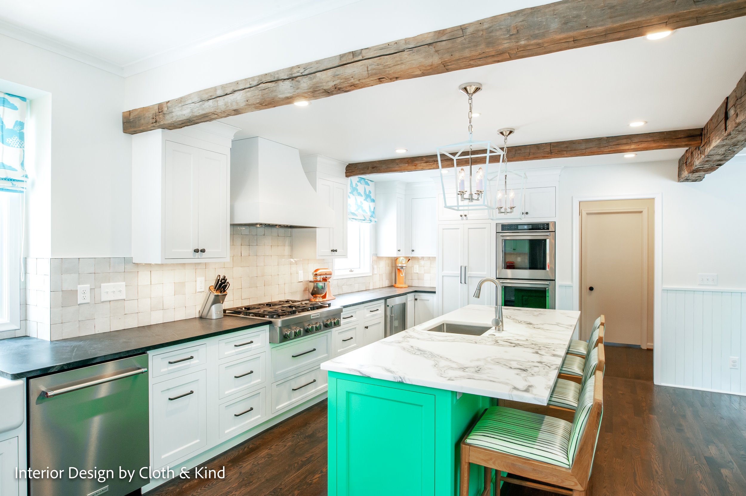
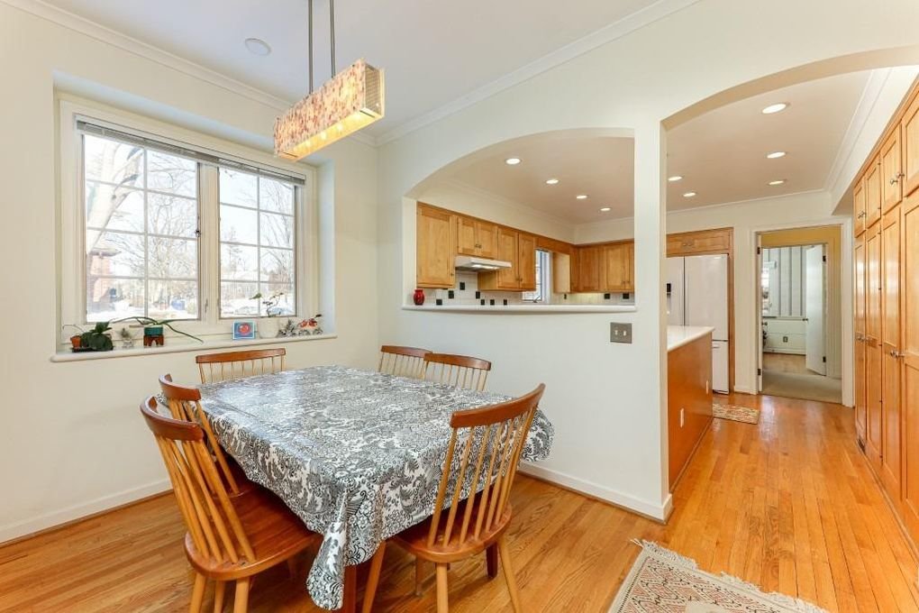
The G shaped kitchen with one way in and one way out in this 1940 2-story brick colonial was not working out for our clients and their young family. Having recently moved into their new home, our clients struggled with the lack of circulation and flow, the difficulty of having more than one cook in the U shaped cooking space, and the separated breakfast area. They wanted a more open and inclusive space where they can eat together, do homework, and entertain. Click here to see after photos of the transformed kitchen; now a more spacious, family friendly space with fun colors and beautiful cabinetry.
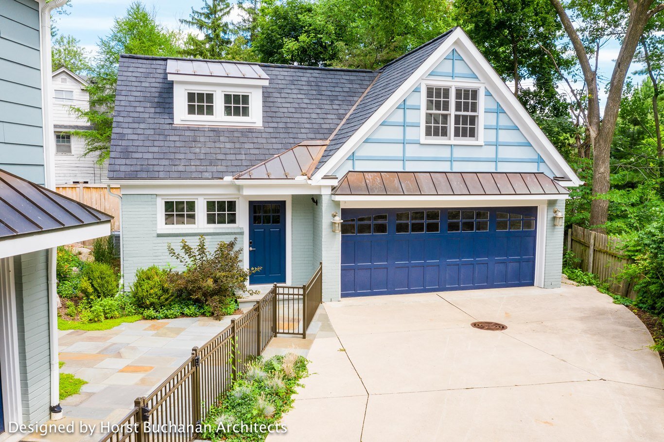
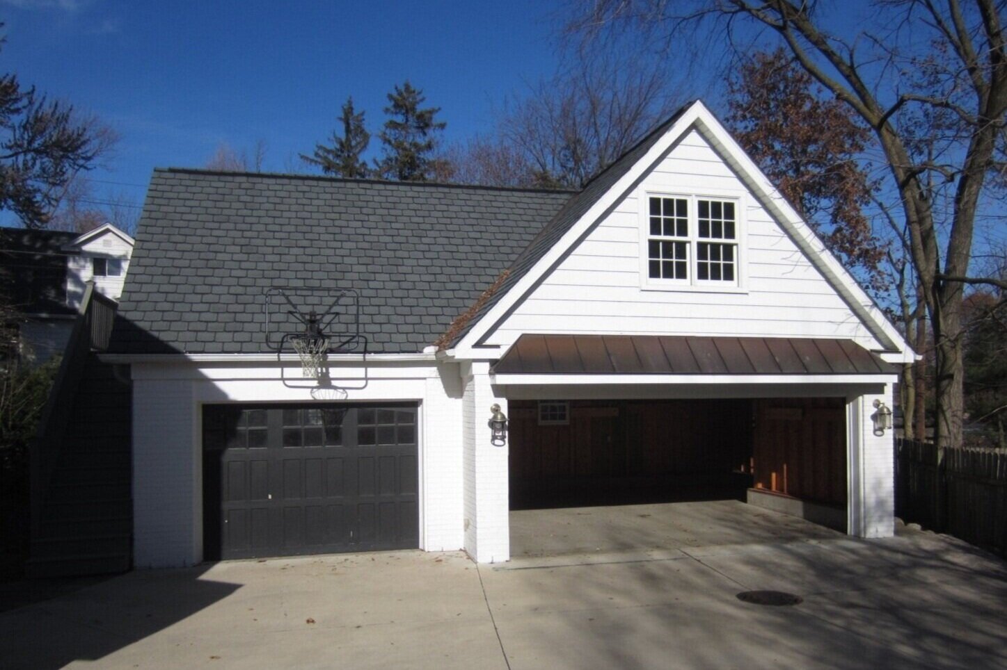
The transformation that occurred in the 2nd floor of this garage is truly breathtaking. To fully appreciate the change, please visit our 'completed Projects' to see some more of the gorgeous after photos. You can see all the after photos on our Houzz profile here.
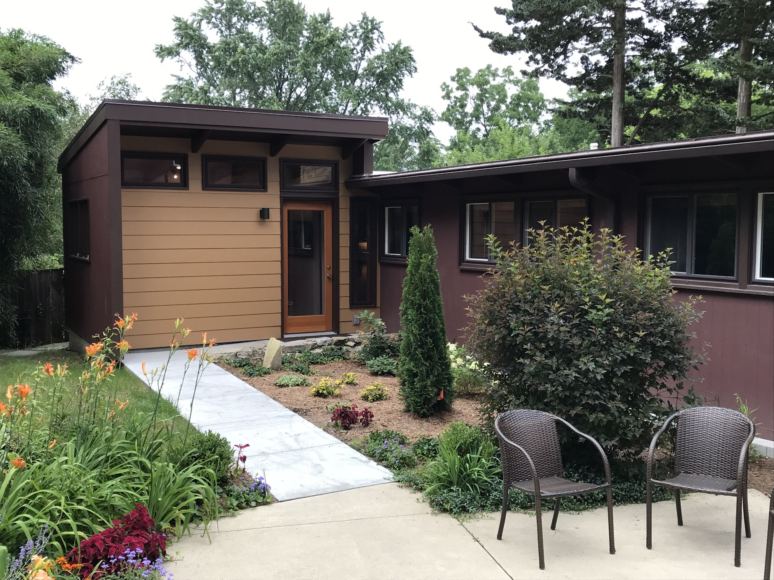
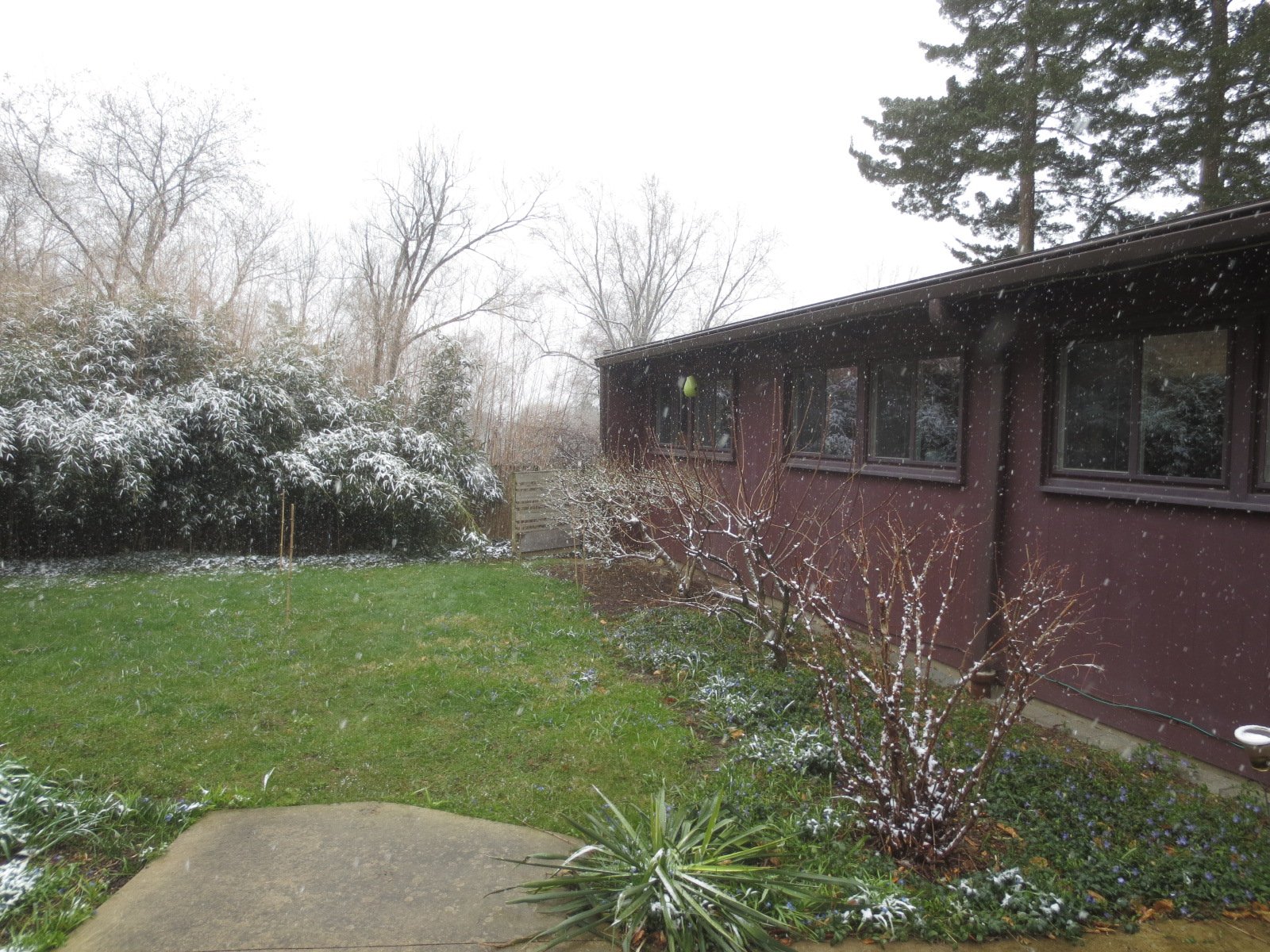
For the master bathroom addition on this Mid-Century Modern home in the Water Hill neighborhood of Ann Arbor our Rochman Design Build team designed while keeping with the home’s architecture, incorporating key elements such at the low pitched roof, wood beams and clerestory windows. Our clients were looking for a space with plenty of natural and artificial light and included a modern walk-in shower. You can see photos of the entire project on our Houzz profile or by category on our website gallery section. See the full transformation as it happened here.
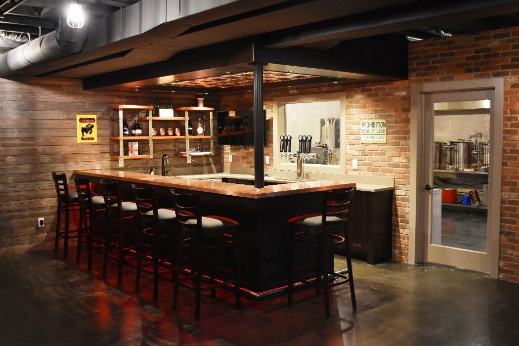
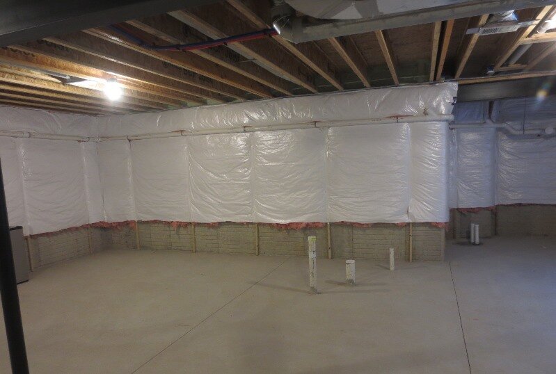
Its not often that we get to work with ‘blank’ spaces, especially when designing a home brew pub; a first for us, and one of our FUNNEST projects. We absolutely love the results and so do our clients. You can see the full transformation as it happened, as well as some of the after photos, here. You can see all the after photos on our Houzz profile.
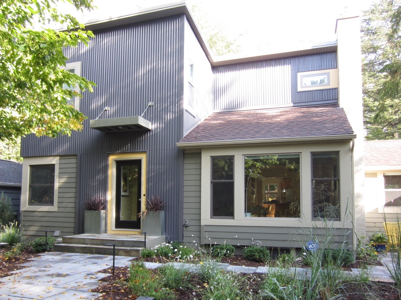
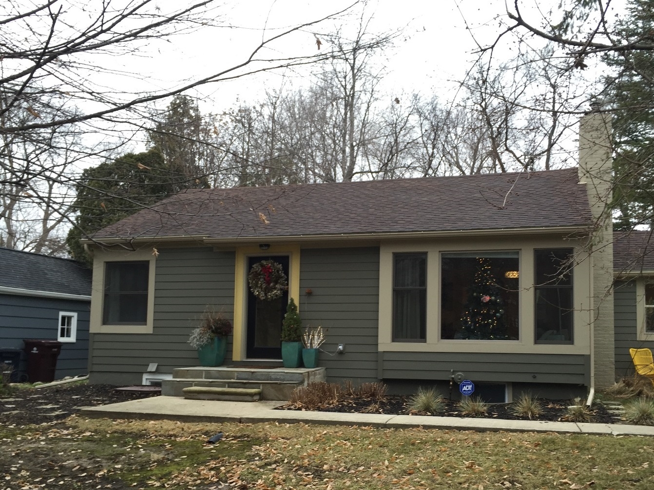
Surrounded by a canopy of majestic trees and a bit back from the road, this quaint 1940s ranch home got 2 serious updates. Our 1st project was a 2nd story addition that included a master bedroom, a walk in closet and a bathroom. In our 2nd project, we flipped spaces. The kitchen, originally located in a tiny room of the house, moved to the other side of the house, and is now spacious much more family friendly. The tiny room has become a little study / hang out room. See the full transformation as it happened here. You can see all the after photos on our Houzz profile here.
This Dutch Colonial home in the Burns Park neighborhood of Ann Arbor is about to get an upgrade with a new kitchen, master suite and guest bath. To fully appreciate the change, please visit our 'completed Projects' to see some more of the gorgeous after photos. You can see all the after photos on our Houzz profile here.
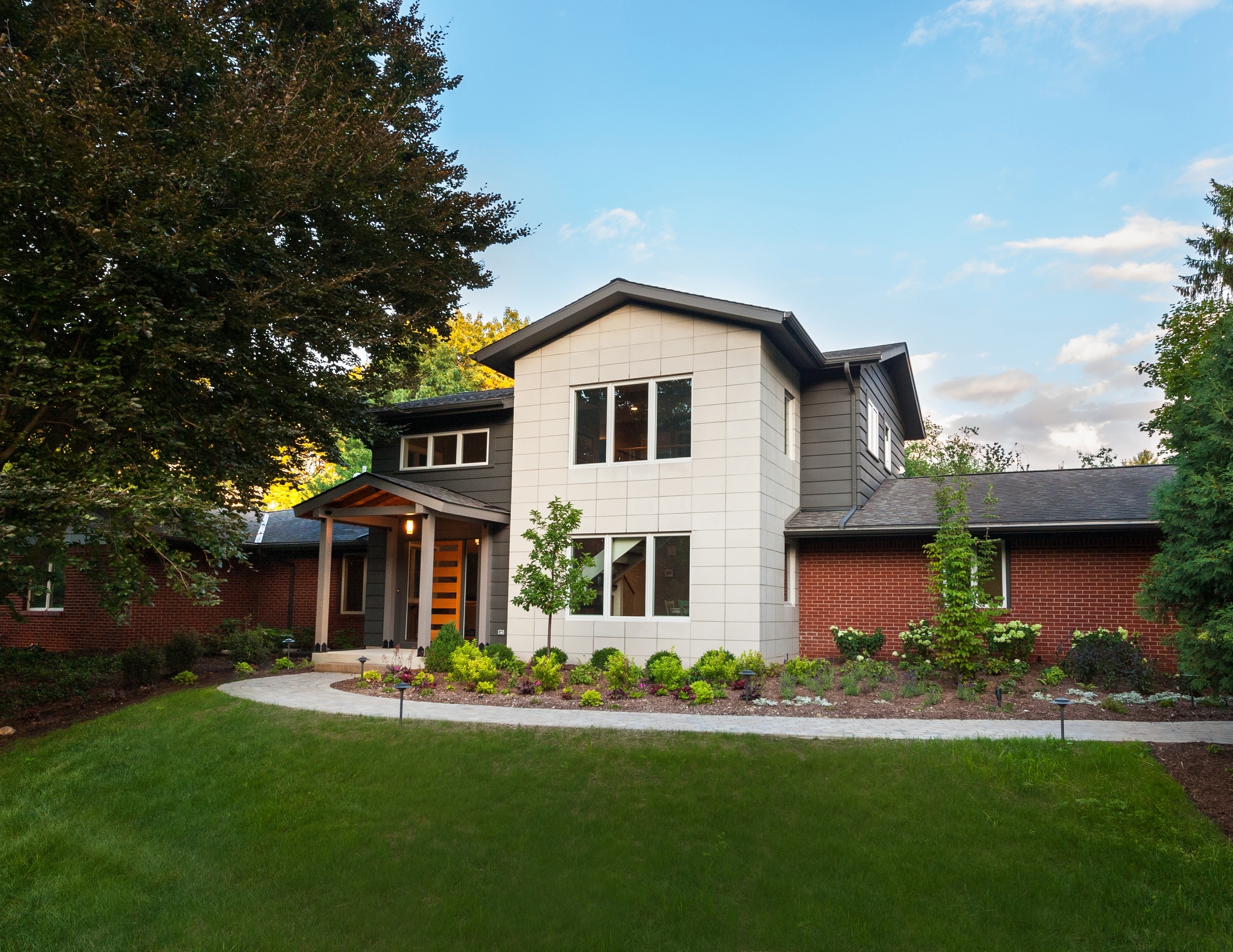
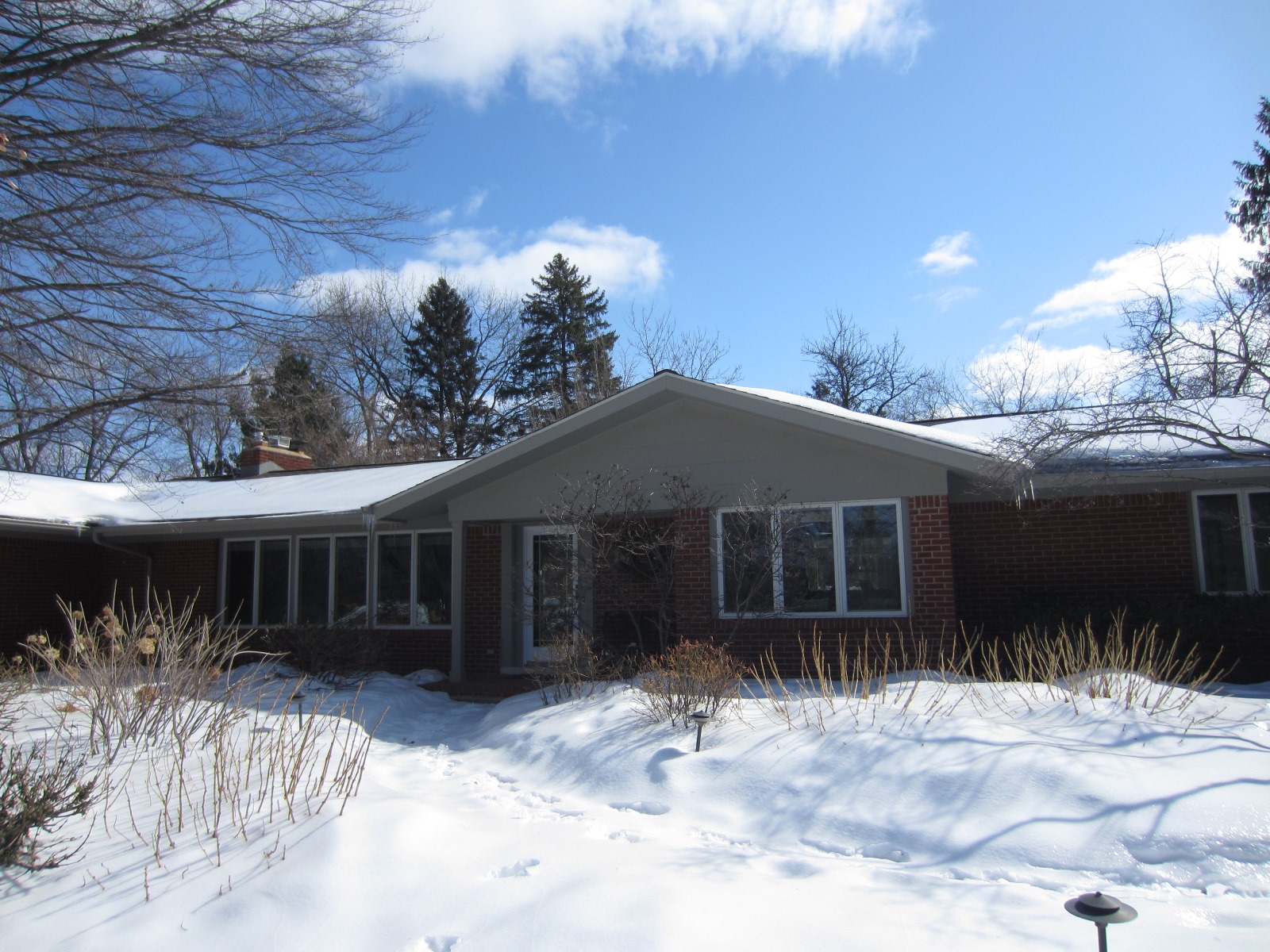
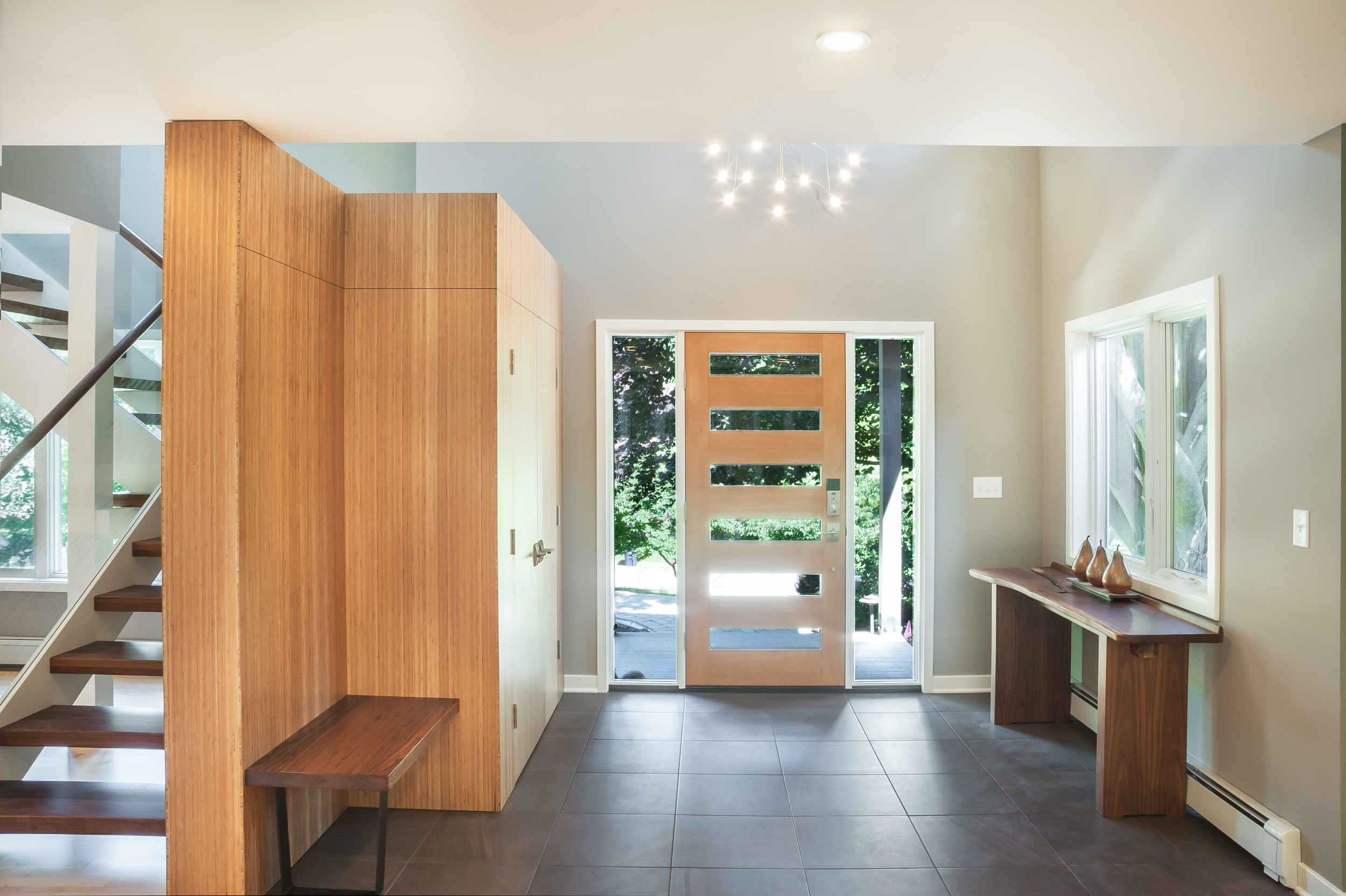
Nestled among majestic trees in Ann Arbor Hills, this ranch truly transformed with a major second story addition. The red brick home got a gray and stone pop up to highlight the dramatic new entrance. The gorgeous new fir door, inlaid with glass is welcoming under the gabled cedar front entry. The 2nd floor addition included a wood and glass curving staircase, a family room, guest room, bedroom and bathroom with penny-round mosaic tiles and a walk-in shower. You can see additional photos of the project on our Houzz profile. You can also see the full transformation as it happened here.
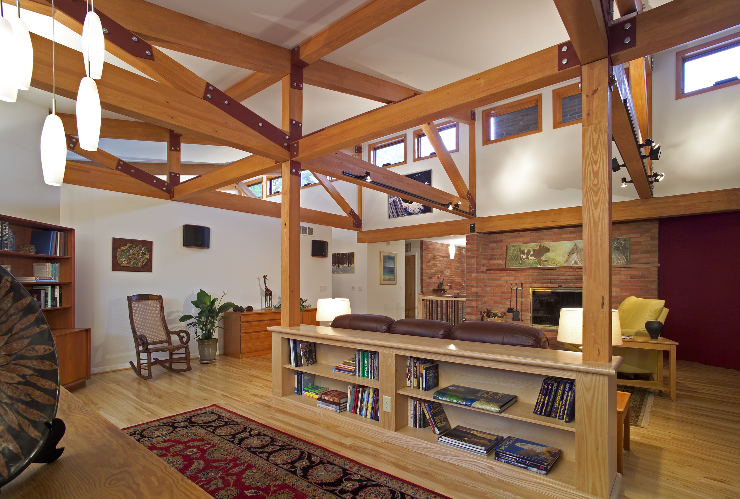
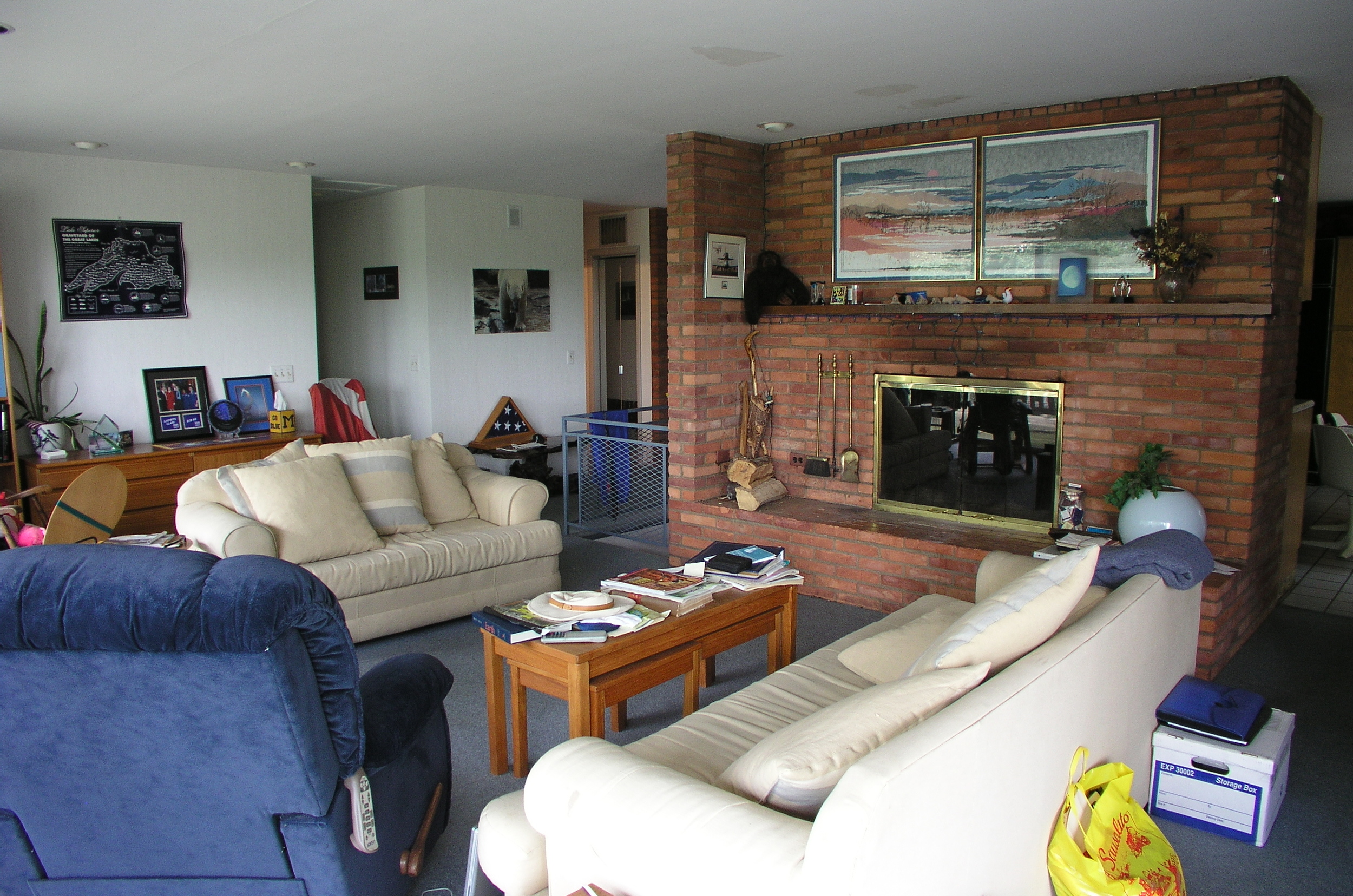
In this Ann Arbor home addition and remodel the only thing that stayed the same in these photos is the fireplace. To give the house a new look and feel, we lifted the roof up and installed clerestory windows, and enlivened the living areas and master suite with exposed timbered trusses. You can see photos of the entire project on our Houzz profile. You can also see the full transformation as it happened here.
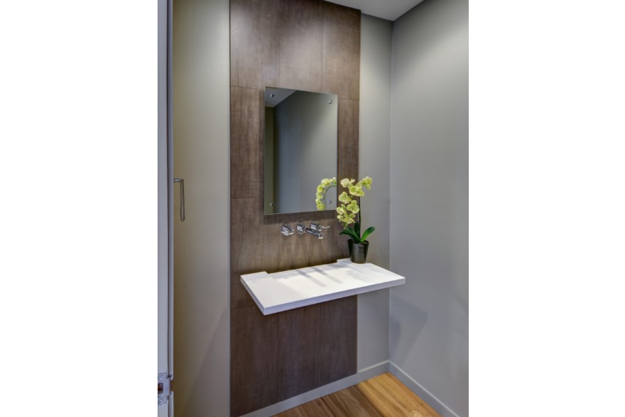
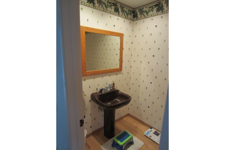
Drastic personality change for this Ann Arbor bathroom/ powder room - bringing it from the 1970’s to 2010’s. The porcelain wall was designed as a floor to ceiling backsplash around this modern sink - a Corian washplane that drains into the wall. A modern wall mounted faucet and a clean mirror with standoffs complete the clean lines. You can see photos of the entire project on our Houzz profile. You can also see the full transformation as it happened here.
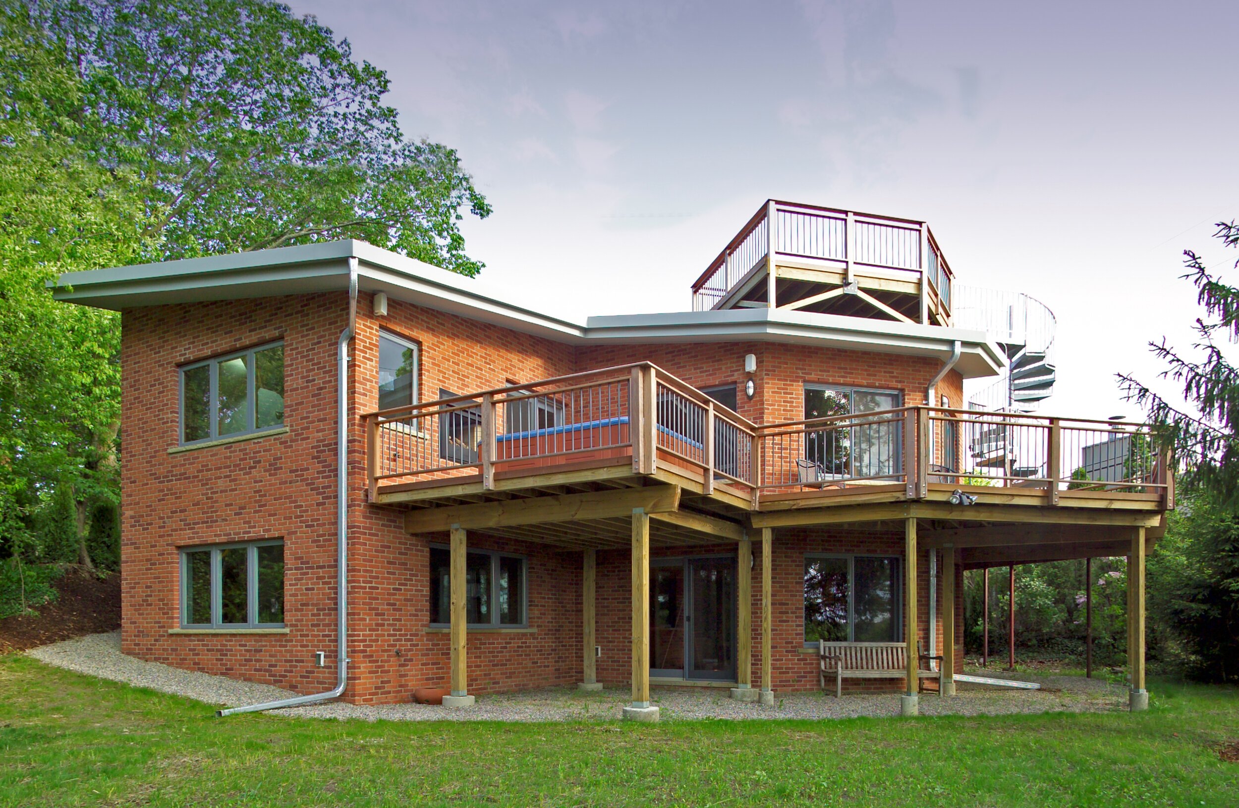
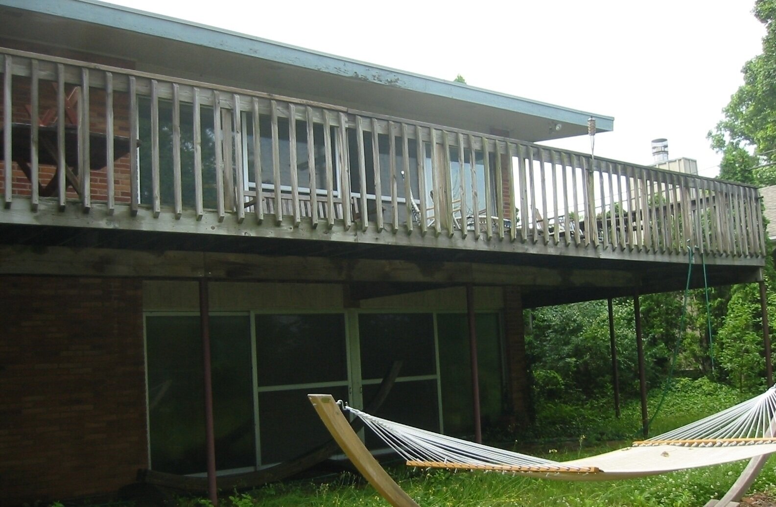
A large multi-story addition graces the back of this walk-out 1960's brick ranch Ann Arbor home. Angled walls throughout the house allow for verdant views from one of the few hills of Ann Arbor. The wrap around deck of Brazilian Ipe is highlighted by a hot tub and an indoor-outdoor fireplace. A new roof top deck is accessible by an outdoor spiral staircase, and is used for stargazing and summer time relaxation. Angled walls frame great views of lush trees all around. This ward winning design provided a creative solution that brought our clients everything they wanted and more. You can see photos of the entire project on our Houzz profile or by category on our website gallery section.
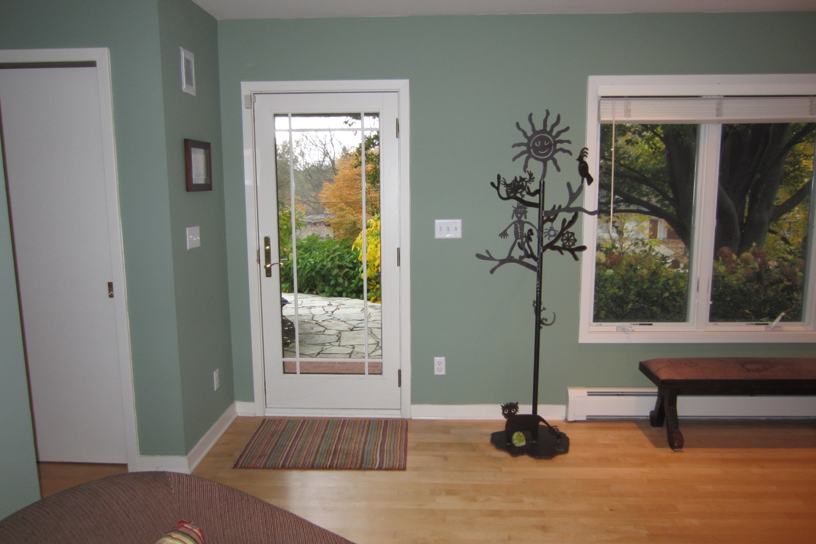
If your eyes are the windows to your soul, then your smile is the front door... One of the most dramatic changes that the Rochman Design Build team brought to this Ann Arbor Hills ranch, is the front entry. a Fir and glass front door nestled between two glass panes invites family and friends alike into the added spacious foyer. Guests can hang up their coats in the beautiful front closet, take off their shoes while sitting on the bench, all under a gorgeous modern chandelier hanging from the tall ceiling. This was part of a 2nd story addition that Rochman Design Build built on this house. To see additional photos of the rest of the project (staircase, TV/Lounge area, 2 bedrooms and a bathroom) please visit our Houzz profile. You can also see the transformation as it happened here.
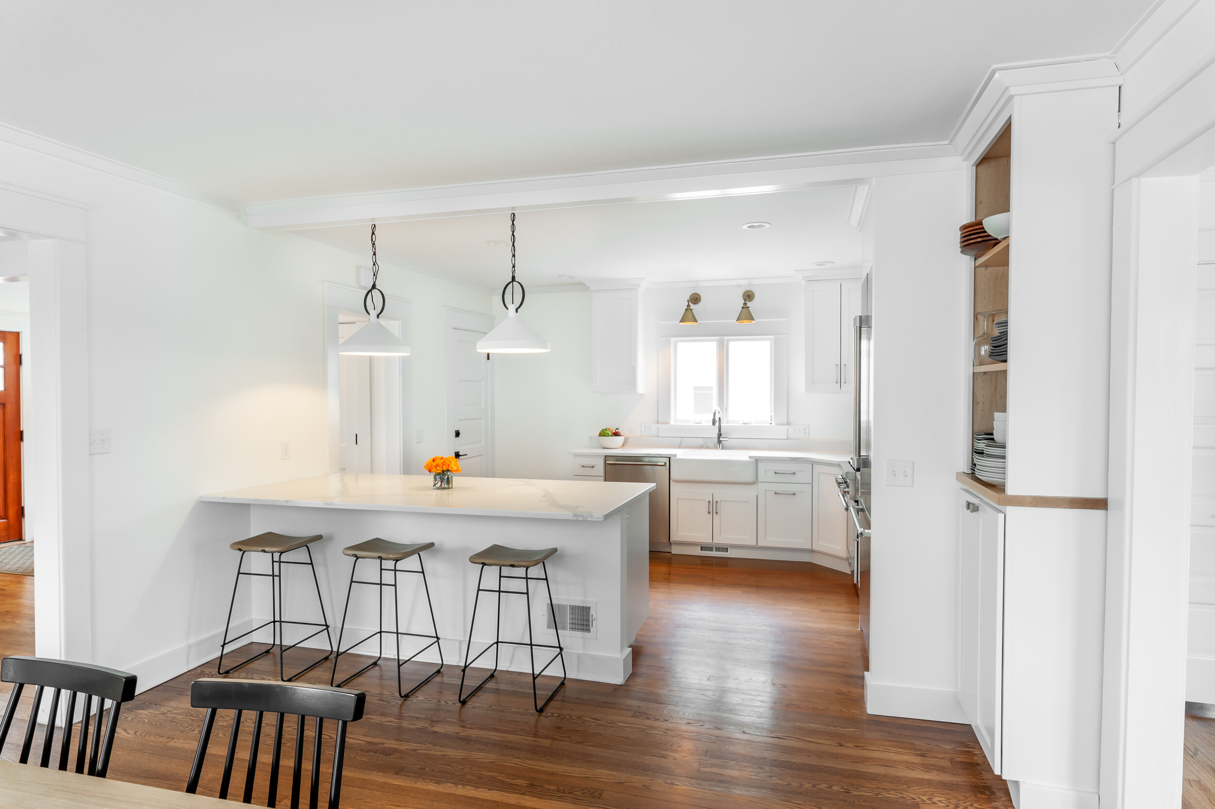
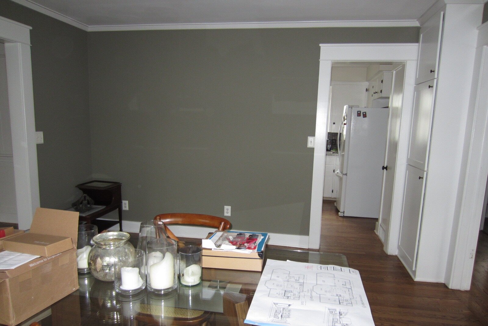
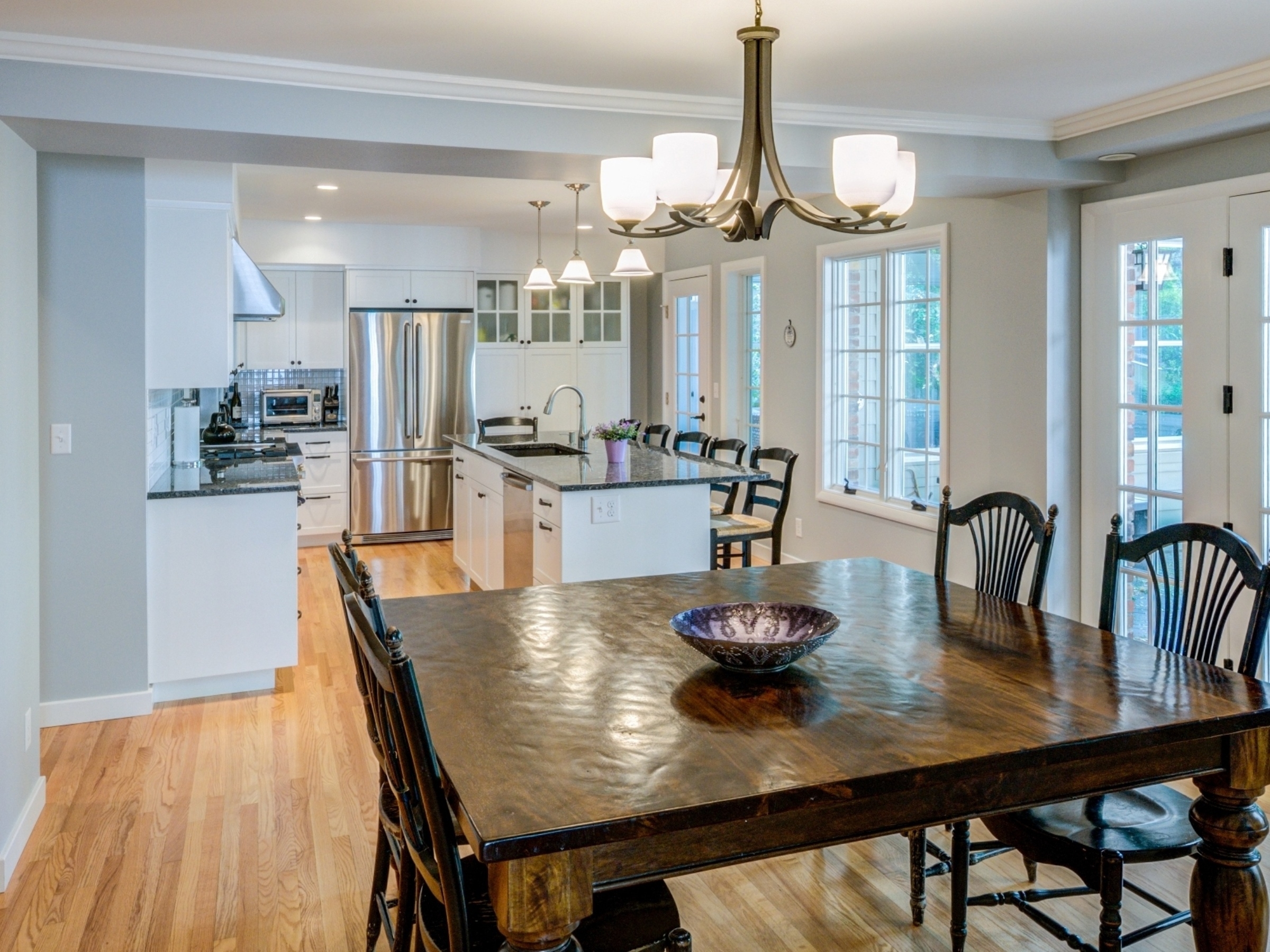
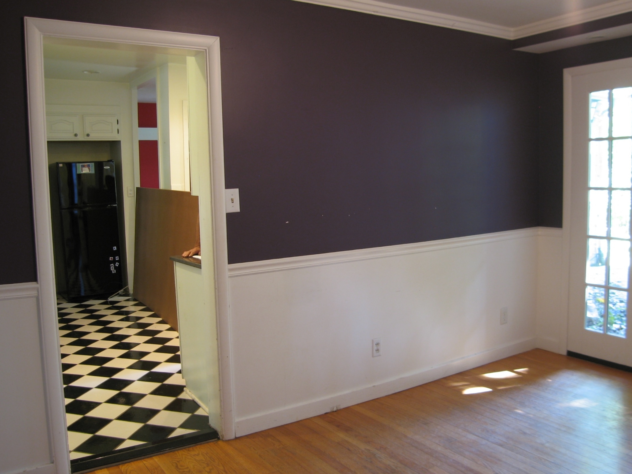
In this Ann Arbor Remodel, A classic Burns Park home gets a wide open kitchen and dining room, combining charm and functionality. Removal of the separating wall meant moving structure, heating, plumbing, and electrical, and it was well worth it! You can see photos of the entire project on our Houzz profile or by category on our website gallery section. See the full transformation as it happened here.
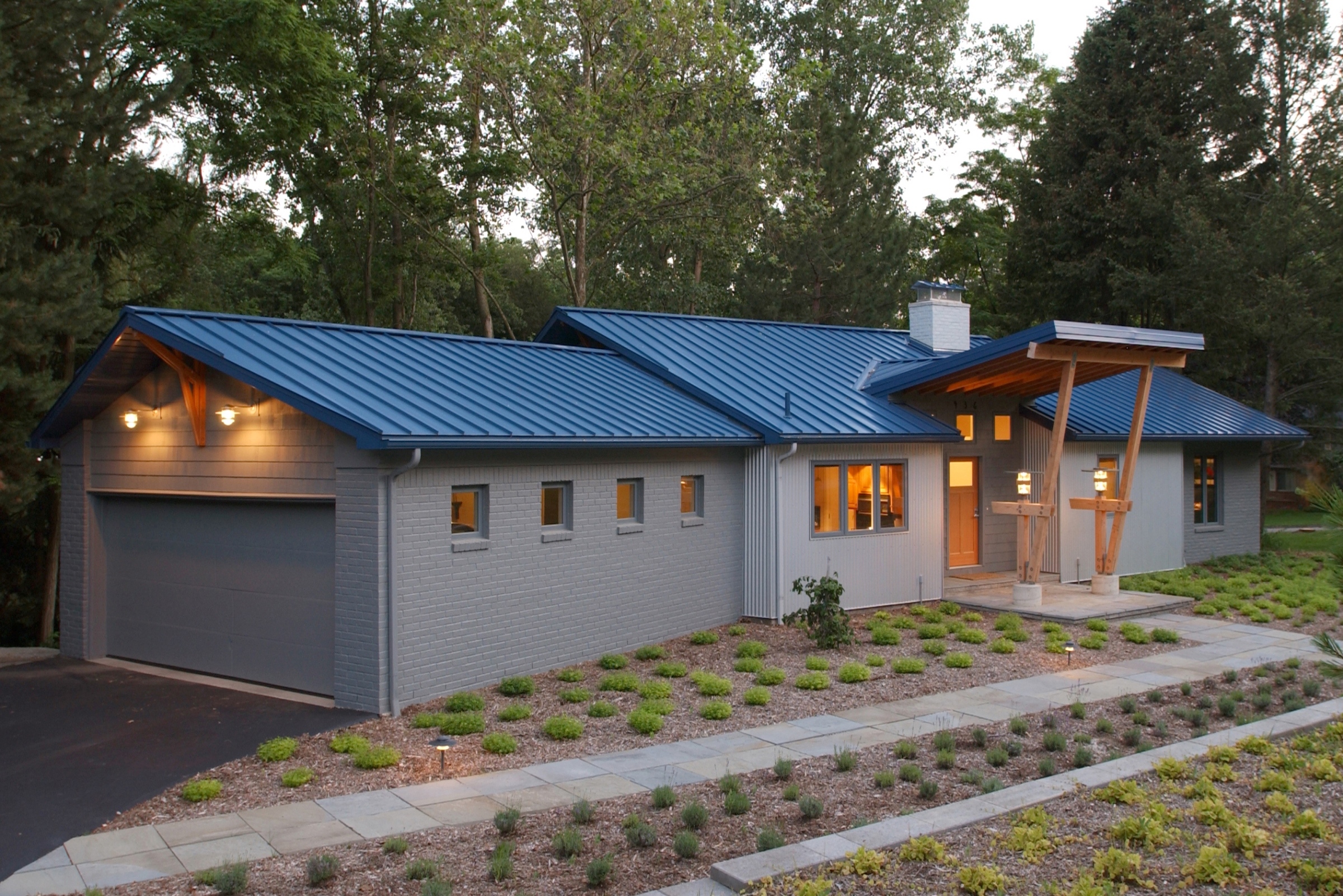
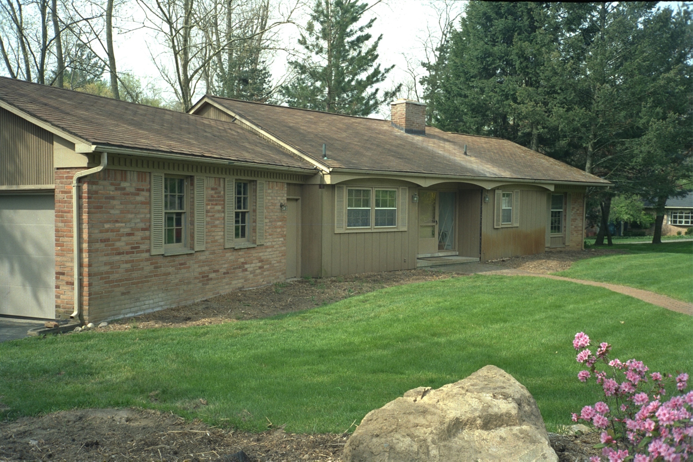
A new style was created by changing all the exterior materials on this completely remodeled Ann Arbor home. The brick ranch home was transformed into a dramatic modern residence featuring standing seam metal roof, corrugated metal siding, painted brick, and a timbered front entry. You can see photos of the entire project on our Houzz profile or by category on our website gallery section.
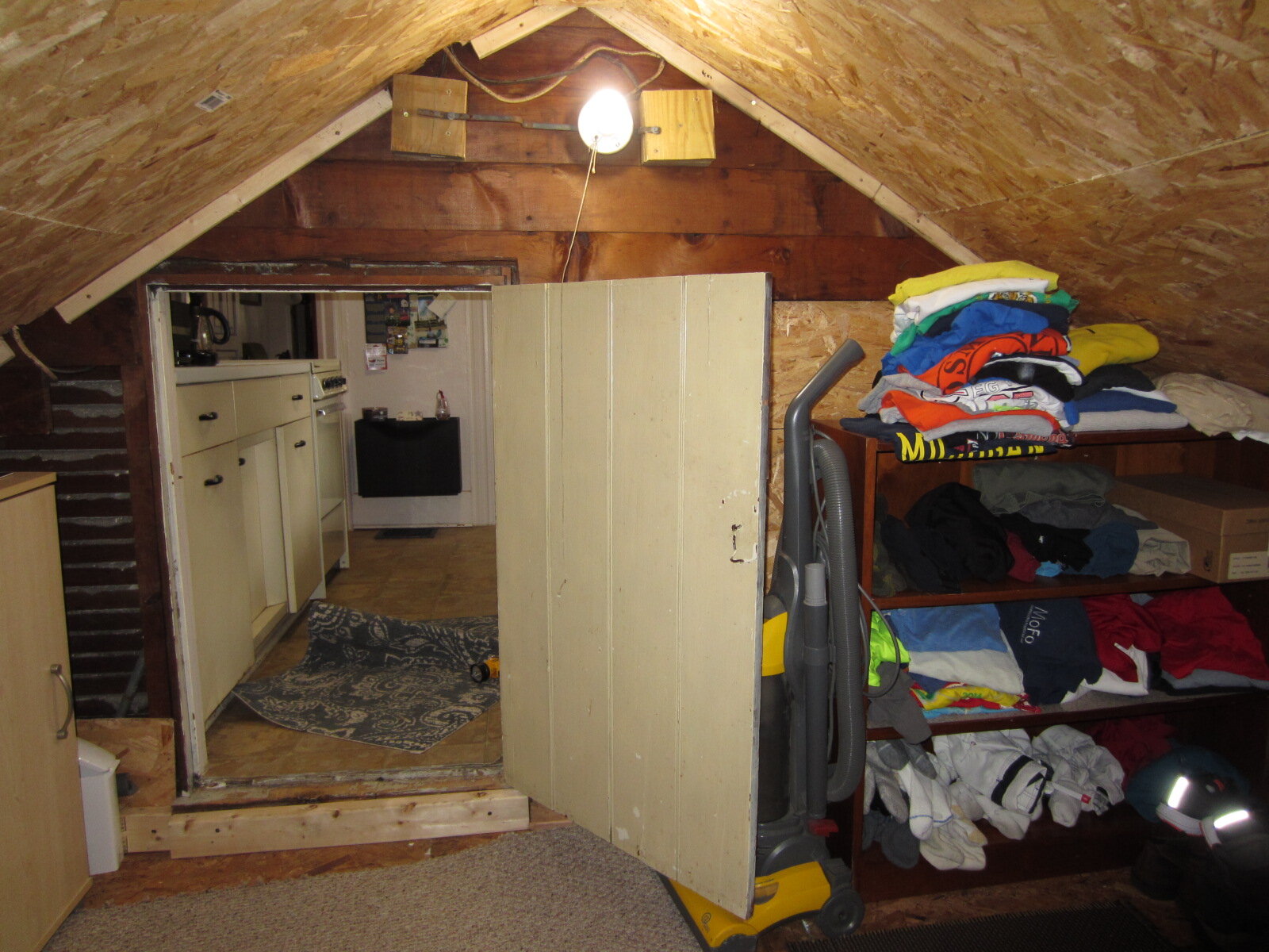
Our clients on the Old West Side of Ann Arbor wanted to change their very tiny 1 bedroom attic apartment into something they could truly enjoy, and for that, they needed space; lots of it. This is the solution our Rochman Design Build team came up with. Our clients are elated... which makes us pretty happy too. See the full transformation as it happened, as well as some of the after photos, here. You can see all the after photos on our Houzz profile.
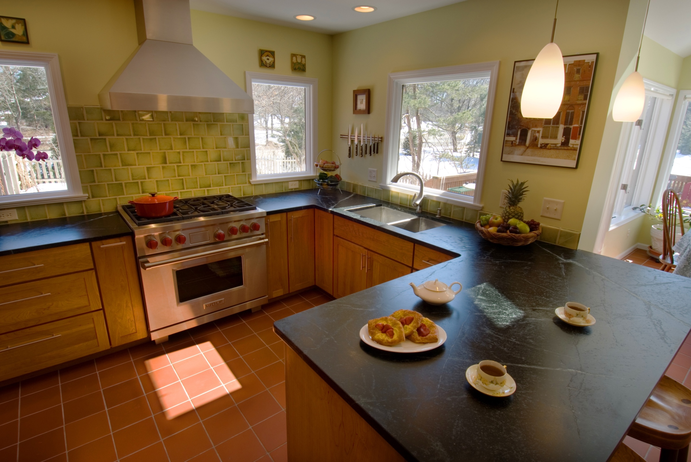
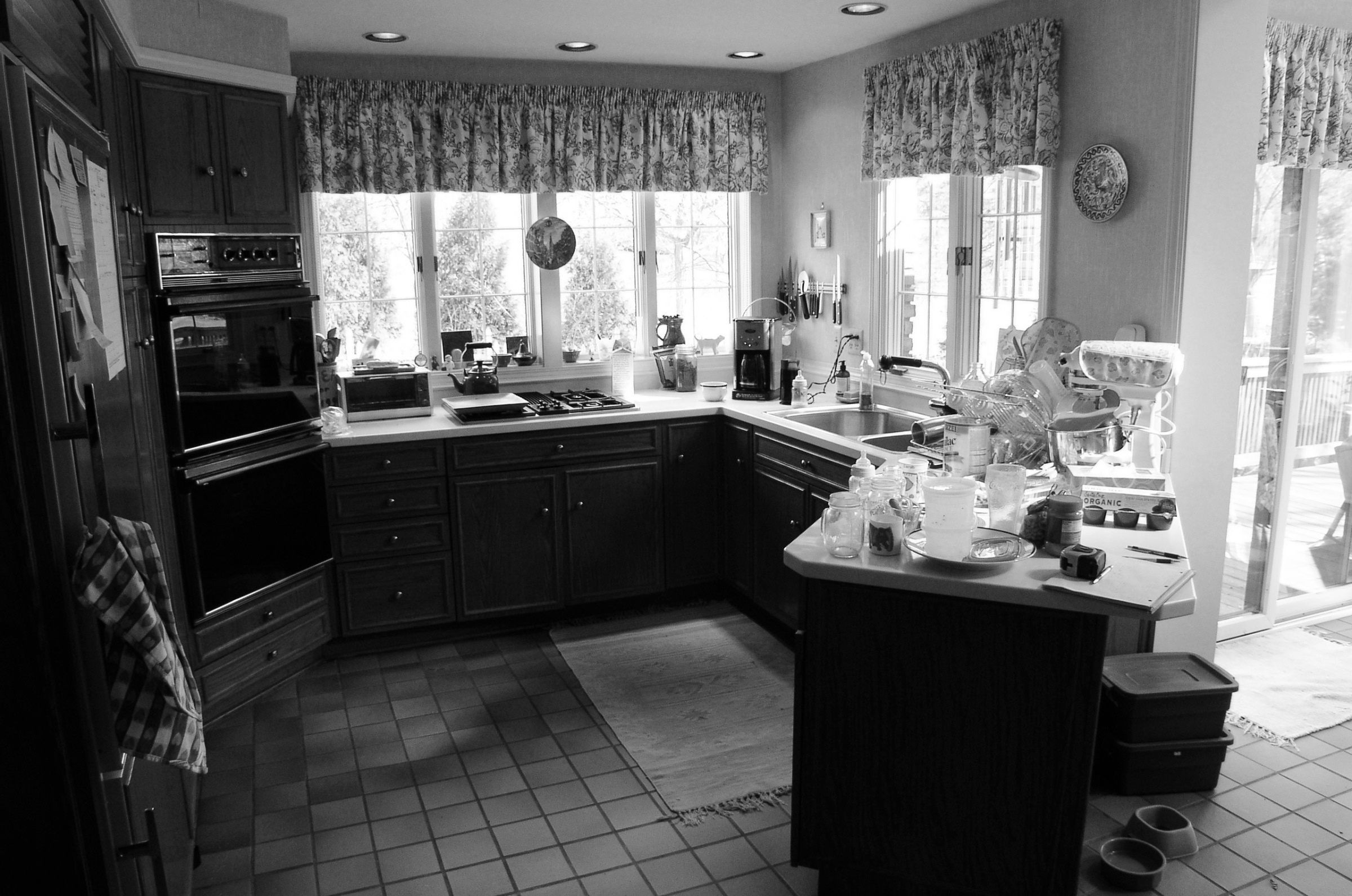
By reducing the number of windows and improving the layout, this kitchen lives and functions beautifully. Soapstone countertops, shaker style cherry cabinets, and a quarry tile floor make this sun filled Ann Arbor kitchen all the more welcoming. You can see photos of the entire project on our Houzz profile or by category on our website gallery section.


